Tuesday 15 May 2012
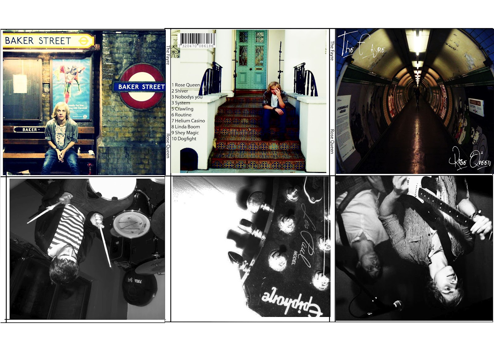
ALL - Final Digipak
Today we finally managed to finish the digipak after creating each prototype and obtaining feedback via our colleagues and Media teacher.

Front cover
Here is the front cover. At the top, you can see the band name in large font which is usually seen in the R&B genre. Then we have the smaller font for the sub-title which gives off a quirky feel because of what it says.
A bonus DVD sticker can also be seen on the front cover as well, advertising a DVD and it's extras. Lastly, the main front cover picture consists of the three performers walking through a suburban environment. This is similar to the back of the digipak which I'll talk about to later.

Spine
Next, we have the spine of the digipak (as seen above). The colouring used for the spine creates a binary opposition between light and dark. This is due to the white font in black space and black font in white space which are similar to the yin yang symbols, which link in with the theory that the band in the video symbolise fallen angels. The catalogue number and company logo are also present.

Inner panel
Here, we have the inside of the digipak. The inside is a two-panel spread which has a picture of the band lying on the floor in the form of three separate images merged into one. The colours of the pictures which make the two-panel spread symbolise the past, present and future. Black and white = silent film associated with the past, colour = present day and blue = hologram linking in with the future. The initials for the band can also be seen. While there are a lack of credits, there are digipaks out there which lack credits such as the Britney Spears Greatest Hits: My Prerogative.

Back of digipak
Lastly, we have the back cover of the digipak which uses most of the conventions seen on digipak. These include, a track listing, list of bonus features, QR code, web addresses, a bar code, the company logo and copyright information. The picture used, links in with front cover because of change in shot type.
ALL - Final Mag AD
Today I FINALLY managed to finish the magazine advert. I got some feedback from my Media teacher on the advert and he said:
There was no point of the multi layering because he said to create a shadow-like effect, but it didn't work.
The font was also weak, since it made the magazine advert look like that it was made in Publisher.
He also mentioned that it looked like no research had been done, despite looking at a number of magazine adverts including some made by past students. Linking in with this, it's quite hard to find magazine adverts aimed at a female audience.
www. should never be used in 2012.
Unrealistic reviews.
Weak layout.
No price tag or Twitter/Facebook logos.
So putting this feedback into mind, created a new magazine ad. My teacher wanted me to put an image from the video in the area where the sky is, so I got a shot of the boyfriend and girlfriend walking down a path. I used the background eraser and quick selection brush tools to delete segments of the background of the picture.
Afterwards, I decreased the opacity and saturation quality so that it blends in with the poster. I also changed the tour dates by adding 2012 at the end of them and making the locations UK based. I also made the font pink so that it would appeal to a female target audience. Lastly a picture of the digipak's front cover can be seen as well so the public know what the product looks like.

FINAL Magazine Advert
Evaluation Question 1, In what way does your music video use, develop or challenge forms and conventions of real media products?
Goodwin's theory was that there are three different types of music videos, performance, concept and narrative. Our video is definitely based on both narrative and performance, because our video involves lip-syncing, and the lyrics can relate to the video. The concept does not occur, because the concept of a music video is based on nothing to do with the lyrics, the video is seen as something quite random. So an example of the concept can be this:
 They may also use shots where an audience member or significant object relating to song is focused on this may show a deeper meaning or a person who may be related to the target audience. They may also include fast paced editing because they have no narrative and they have to keep the audience interested especially when targeting youth audiences.
Contrasting with these ideas in the R&B genre forms and conventions differ for example; they often have a lot of flashy objects such as cars, jewellery and money and are featured wearing black and white suits and dresses as the genre represents wealth and glamour apposing ideologies of black families living in small homes with the extended family. These are the common codes and conventions you would find in a typical R&B video. But R&B videos may also include dance routines and focus on the main singer as the product rather than the music being delivered because of this convention in our music video we dressed our band members in dresses and in one part of the narrative we enforced the sense of class in dress by dressing them in long flowing dresses with the lead singer wearing a large diamond covered necklace and simplistic make up. This was influenced from the well known girl band 'The Saturdays' song 'Missing you'
Codes and Conventions for Digipaks include the material used to make the Digipak. It is made from paper board which is recyclable and therefore more environmentally friendly than a CD jewel case, although they may have plastic inner CD/DVD tray. The band name is usually clear on the front unless there is a symbol representing the band and we used 'Eurostile' font due to the fact that it can give off a R&B vibe. The band image or print on the front is usually recognisable, website information and band website for people to find out more information is displayed, the band and album name on the side, including category number and company logo, a brief description of the band or a lyrics sheet in sometimes found on the inside booklet providing fans with extra information, copy tight information and there is always a barcode finally, there is often a leaflet inside which may show lyrics of each song included or photos of the band in performance usually ie. some use festival photos.
Digipaks arn't used hugely at the moment even though they are more environmentally friendly consumers are used to buying CD although most people download it illegally or buy their music online. Digipaks can have four or six panels most commonly. When constructing our digipak we had previously done a photoshoot with the band members playing Destiny's Child so we had a lot of images to choose from. The clothing differed from the footage the band had featured in as we wanted to show a more feminist and strong appearing group of females which Destiny's child are. We chose to use very tight clothing all round and focused on features that may enable the male gaze audience. One member of the band is in metallic leather leggings which is a strong masculine signifier but is also seen when worn as a sexy and dominant figure, Melodie who plays Beyonce is always seen in a different outfit to the other band members, this is to stick with the original codes and conventions of Destinys Child or any girl band. All of the band members are photographed in heels to highlight the legs and bring attention to the male audience. Annie wears a crop top which Destiny's child have always been photographed in to show off their figures, showing the abdominals which is also typically a masculine feature, the band do this to challenge the male stereotypes and appear as strong and powerful women.
The front cover of the digipak we thought was the strongest shot of the band, as it is a long shot of them walking into the camera. We also chose to take the photo outside and we rejected feedback that the road we photographed them on looked a bit trashy because we wanted to present an urban look as the band like to see themselves as urban even though they are highly commercial.

 The title of the band is also prominent and we decided to call the Digipak 'Growin' Up: The Best of' because Beyonce has recently had her first baby so we thought we'd like to show a transition from the younger days of the band up until the time at which they split up. We included a sticker at the bottom of the Digipak which showed the variety of special features, a bonus DVD and behind the scenes footage as the public are still buying music online and CD's producers enable extras to persuade people to buy the Digipaks. The Bonus features sticker is black and yellow, yellow is used because it is aimed at the female audience but black can be related to the male audience, so these primary colours can sell to both genders, which helps when selling to our target audience. The interior panel we weren't initially sure about but we knew we wanted a close up of the band members and after looking at Digipaks such as Rihanna and Katy Perry we decided to do a spread across both interior panels with layering in each corner, presenting the female dominance of the band. The back of the digipak shows the songs on the CD with times and features, which is what the bonus DVD includes on the right. Underneath this we included copyright information which is a key convention of digipaks and all music products. As we hadn't found any Digipaks without this information, the QR was created so that when it was scanned it can be linked via smartphones to the official website, (Blazing grace productions) which is new technology that has recently come about and can be found in magazines or featured on CD's. The barcode is always found on CD/DVD's and all media products.
 Forms and conventions of Magazine Advertisements: The band name is shown in bold text to make it stand out, using the font 'Eurostile' this is key if the background of the advertisement is busy as the audience want to know what the ad is about as soon as possible before losing interest. A good example of this is the Destiny's Child cover for Rolling Stone magazine the band are dressed in camoflarge which links with there survivor music video.
But an example for the concept and narrative of videos can be Professor Green, read all about it.
Our fifteen music video deconstructions we were able to pick out the main conventions of music videos before looking more deeply into genre specific music videos, these included: Lip syncing, shot variation, shot angle variation, close ups of the lead singer, different locations, interesting mise-en-scene, high use of lighting and usually fast paced editing. If the music video were to be performance based there is no narrative therefore shots are focused solely on the singer but may also include shots of the audience and instruments.An example of this can be Beyonce's Single ladies.
 They may also use shots where an audience member or significant object relating to song is focused on this may show a deeper meaning or a person who may be related to the target audience. They may also include fast paced editing because they have no narrative and they have to keep the audience interested especially when targeting youth audiences.
Contrasting with these ideas in the R&B genre forms and conventions differ for example; they often have a lot of flashy objects such as cars, jewellery and money and are featured wearing black and white suits and dresses as the genre represents wealth and glamour apposing ideologies of black families living in small homes with the extended family. These are the common codes and conventions you would find in a typical R&B video. But R&B videos may also include dance routines and focus on the main singer as the product rather than the music being delivered because of this convention in our music video we dressed our band members in dresses and in one part of the narrative we enforced the sense of class in dress by dressing them in long flowing dresses with the lead singer wearing a large diamond covered necklace and simplistic make up. This was influenced from the well known girl band 'The Saturdays' song 'Missing you'
The band members are seen in three different outfits reinforcing the idea of wealth and self importance we always see in R&B music videos although in our video it is a female group rather than a typical solo male which tend to dominate in R&B music videos. In Destinys Child's song 'Lose My Breath' the girls are seen in three different outfits.

Instead of focusing on objects such as flashy cars we encorporated a diamond chandelier to demonstrate the idea of wealth and the class of the band members as money is a huge part of R&B culture, we would never of been able to use the cars as a code and convention due to the budget difference.
Instead of focusing on objects such as flashy cars we encorporated a diamond chandelier to demonstrate the idea of wealth and the class of the band members as money is a huge part of R&B culture, we would never of been able to use the cars as a code and convention due to the budget difference.
We have challenged the convention of using one male or female dominating the narrative aspect and replaced it with a couple as the song is telling a story of heartbreak and betrayal when the boy in the relationship is found out to be cheating on his girlfriend, we found that instead of 'sugar-coating' the relationship which many video's do, we would keep to the heartbreak, due to the fact that any teen watching our music video will be able to relate and it gives a sense of realism for our audience members. Shots of the band on the front cover of the digipak and the magazine ad represent the idea of feminism and female unity as they pose holding hands in a low angled shot. As you can see in this picture...
We chose locations which could be seen as being romantic in both performance and narrative aspects of the video for example, the band are singing by a lake which the sun is shining on and at the end of the video it starts to cloud over around this location. Again 'The Saturdays' have used out door locations to give that heartbreak, romantic feel to fit in with their song.
We chose locations which could be seen as being romantic in both performance and narrative aspects of the video for example, the band are singing by a lake which the sun is shining on and at the end of the video it starts to cloud over around this location. Again 'The Saturdays' have used out door locations to give that heartbreak, romantic feel to fit in with their song.
One of the narrative aspects was filmed at the park where the couple a featured feeding ducks and holding hands while walking around the park (a close up of the couple holding hands at the beginning creates a sense of unity and romance). These locations were also chosen to appeal to our secondary target audience who we would expect to watch romantic comedy films.
A side shot of the band was used while they were lip syncing to show the band were as one and because it is a common convention in band music videos. Lip syncing is a key convention in all music videos except when the band is performing live at concerts or gigs, this convention has a reluctancy to change in music videos as it had always been used which shows that the passing of time can not change conventions. Also we used close up shots of the band which is used regularly in girl band video, for the male gaze aspect.
With any girl band we made sure that our costumes used could relate to any girl band and be quite revealing, again for the male gaze aspect. We also challenged the convention of using a lot of dance moves, as R&B music videos are often filmed in clubs or at parties because the song we chose was less upbeat we decided to go against this idea, also in Destinys Childs original video there is no dancing involved for this specific song.
Codes and Conventions for Digipaks include the material used to make the Digipak. It is made from paper board which is recyclable and therefore more environmentally friendly than a CD jewel case, although they may have plastic inner CD/DVD tray. The band name is usually clear on the front unless there is a symbol representing the band and we used 'Eurostile' font due to the fact that it can give off a R&B vibe. The band image or print on the front is usually recognisable, website information and band website for people to find out more information is displayed, the band and album name on the side, including category number and company logo, a brief description of the band or a lyrics sheet in sometimes found on the inside booklet providing fans with extra information, copy tight information and there is always a barcode finally, there is often a leaflet inside which may show lyrics of each song included or photos of the band in performance usually ie. some use festival photos.
Digipaks arn't used hugely at the moment even though they are more environmentally friendly consumers are used to buying CD although most people download it illegally or buy their music online. Digipaks can have four or six panels most commonly. When constructing our digipak we had previously done a photoshoot with the band members playing Destiny's Child so we had a lot of images to choose from. The clothing differed from the footage the band had featured in as we wanted to show a more feminist and strong appearing group of females which Destiny's child are. We chose to use very tight clothing all round and focused on features that may enable the male gaze audience. One member of the band is in metallic leather leggings which is a strong masculine signifier but is also seen when worn as a sexy and dominant figure, Melodie who plays Beyonce is always seen in a different outfit to the other band members, this is to stick with the original codes and conventions of Destinys Child or any girl band. All of the band members are photographed in heels to highlight the legs and bring attention to the male audience. Annie wears a crop top which Destiny's child have always been photographed in to show off their figures, showing the abdominals which is also typically a masculine feature, the band do this to challenge the male stereotypes and appear as strong and powerful women.
The front cover of the digipak we thought was the strongest shot of the band, as it is a long shot of them walking into the camera. We also chose to take the photo outside and we rejected feedback that the road we photographed them on looked a bit trashy because we wanted to present an urban look as the band like to see themselves as urban even though they are highly commercial.

 The title of the band is also prominent and we decided to call the Digipak 'Growin' Up: The Best of' because Beyonce has recently had her first baby so we thought we'd like to show a transition from the younger days of the band up until the time at which they split up. We included a sticker at the bottom of the Digipak which showed the variety of special features, a bonus DVD and behind the scenes footage as the public are still buying music online and CD's producers enable extras to persuade people to buy the Digipaks. The Bonus features sticker is black and yellow, yellow is used because it is aimed at the female audience but black can be related to the male audience, so these primary colours can sell to both genders, which helps when selling to our target audience. The interior panel we weren't initially sure about but we knew we wanted a close up of the band members and after looking at Digipaks such as Rihanna and Katy Perry we decided to do a spread across both interior panels with layering in each corner, presenting the female dominance of the band. The back of the digipak shows the songs on the CD with times and features, which is what the bonus DVD includes on the right. Underneath this we included copyright information which is a key convention of digipaks and all music products. As we hadn't found any Digipaks without this information, the QR was created so that when it was scanned it can be linked via smartphones to the official website, (Blazing grace productions) which is new technology that has recently come about and can be found in magazines or featured on CD's. The barcode is always found on CD/DVD's and all media products.
  Forms and conventions of Magazine Advertisements: The band name is shown in bold text to make it stand out, using the font 'Eurostile' this is key if the background of the advertisement is busy as the audience want to know what the ad is about as soon as possible before losing interest. A good example of this is the Destiny's Child cover for Rolling Stone magazine the band are dressed in camoflarge which links with there survivor music video.
They provide realise dates for tours and CDs because Destiny's child are such a big band we decided that they would only play at huge venues like Madonna does nowadays as they have the same sized fan base so we chose big arenas to advertise on our magazine ad. We found an advert advertising the fan club and releasing tour dates if readers signed up to a particular fan site so we included tour dates and titled the tour, Newspapers or magazines often give the products a star rating out of 5 and because of the size and popularity of the band we gave them a high rating of 5/5, Band information and band websites so people know where they can find out more information on the band.
Record label information and a copyright statement. Band image or cd image. Websites related to the band are shown such as there Twitter name and Facebook page. The singer or band dominates the advertisement for example in all of our texts Mel was in the middle of the other two band member because she was playing Beyonce the main singer in the band. Female bands or solo singers in particular often go into advertising beauty and cosmetics (Beyonce releases perfume scents annually aswell as being a Loreal girl advertising a new lipstick shade) we could of added a scent to our magazine ad which would of encorporated this but as only Beyonce has done this it was not representing unity and togetherness that the band aimed to display before they split up. Since the split, the band members have also released solo careers such as Beyonce's and her endless top ten hits, and Kelly Rowland's career as a judge on the X Factor. We used multilayering on our magazine ad of a couple holding hands to show the narrative aspect of the video that we wanted to get across because normally in R&B music videos the artist/s dominate so we challenged this convention.
Evaluation Question 2, How effective is the combination of your main product and ancillary texts?
Our coursework task was to produce a package which included, a Digipak, a Magazine Ad promoting the Digipak, a Music Video for a DVD to be placed into the Digipak.
As a group, we came up with our own production team, 'Blazing Grace Productions' As a group we developed our ancillary packages and produced and directed our music video, to our song 'Emotion' by Destiny's Child, which was originally sung by Samantha Sang, an Australian pop singer in the 90's. In the actual music industry separate companies would be responsible for each individual product involved in the package, so unlike our task, one company would not manufacture all three of these products.
In the actual Music Industry a company such as Epik Music Videos who direct, edit and film Music Videos, Behind The Scenes Documentaries and Event Filming. Epik Music Videos, mainly appeal to young, up and coming directors. Below is an example of a video made by Epik Music Videos.
"We make Music Videos, Electronic Press Kits (EPK’s), Behind the Scenes Documentaries AND Event Filming, all at an affordable price.
Here is an example of a video made via EPIK MUSIC VIDEOS:Young up and coming directorial, behind the camera and editing talent created all of the videos you can see above since May 2011.We’re always looking for exciting artists to work with and you should expect to pay around £1,500 for a video WE LOVE MUSIC VIDEOS and are dedicated to the craft and culture. Bring on Rock, Rap and Indie, bring on Hip-Hop, Heavy Metal and Pop, bring on Classical, Dance, and Soul.Ask about our EPK package, which combines your music video and a behind the scenes.When it comes to genre you name it we can visualise it. Give us a call, email or fill out one of our contact forms (above) to get in touch and bring your music to life."
http://stream3.webvideos.co.uk/previews/9lNGEPZp-7WjNpJBI
Our music video used multi layering throughout, to show the performance and narrative, also to show the passage of time.One part of our Ancillary texts was a Digipak which is a style of CD or DVD packaging, they typically consist in the form of a book- style paperboard or card stock outer binding, with one or more plastic trays capable of holding a CD or DVD attached to the inside, sometimes they can include pull out lyrics sheets. Originally we were not going to use layering but we thought we should involve the band from the performance aspect. Examples of Digipaks, that don't use multi layering when having spreads in the middle are one such as this :
|

 |
Front Panel
The third part of our task is a Magazine Advert, this part is vital for the sell of your Digipak and Video. They can promote them seperatly with no real connection or they can sell them as a package, as the Mag ad may include something about the special features involved in the Digipak.
Magazines are a very good way of advertising promotions like this as they are regualry bought by people, usually to see a Destinys Child advert you would find it in a magazine such as 'Heat' or 'OK!'. The target age for magazines such as the above are similar to our music video (15-24), so our audience would widen if we were to put our Mag ad in a magazine such as the above.
Here is our final Magazine Ad:

Originally we were going to use multi layering on the magazine ad to make the band look like they were walking away from the camera.
<---- This is our original picture and to include the multi layering effect, you can notice in the top left hand corner we included narrative from the video, we did this to incorporate both performance and narrative, because it can relate back to the video.
Multi-layering gives a chance for new media technologies to express a new view on music videos.
We also used multi-layering with the inner panels for our Digipak:
The reasons for our inner panels were to represent the differences in colour and to show how time had past which can relate to our music video. The black and white shows the past, the colour is the present tense and the sci-fi looking picture to the right is to represent the future. We did use the same picture with both the Digipak and Mad Ad. But we varied the colour scale so that the background was a grey scale compared to the Digipak back panel which was all kept in colour. 
This is because you can have a dark side and a pure side, which we felt was appropriate to the music video, whether it be the deeper meaning of either the narrative or performance or just the costumes that the band members wear, relating back to the book of enoch, with the fallen angels.
|
Evaluation Question 4, How did you use new media technologies in the construction and research, planning and evaluation stages?
In the Research and Planning stage, I came across many different technologies when looking into my band, Destinys Child, overall most of them were internet based.
 The main new media technology I used during the whole coursework would be Blogger, this was our main place where we would blog about our research into our band, all the band information would be found here.
Vimeo was also a useful source I used when uploading and sharing my videos. As you can see from the picture above Vimeo allows you to share videos on both Facebook and Twitter. This helped alot when wanting a quick and easy way to get audience feedback.

Youtube was also a very regular source myself and my group used. It's a lot faster and easier to use than Vimeo but as we can't access Youtube at school it was only a possible source when doing work from home. My Media teacher also had his own Youtube channel, this allowed us to watch other groups and our own videos in progress to the final cut. It was also easier to access comments on your videos for further audience feedback. Here is his youtube channel...
Youtube aloud us to watch videos, from home, when researching our genre we were able to watch previous music videos, from Destinys Child or other girl bands such as TLC , helping us look closely at the common conventions needed when making a girl band music video, rather than just seeing it in writing form, from websites such as Wikipedia. Also Youtube has pages for certain artists, with a list and links to their videos, only making it easier when trying to find videos for Destinys Child. Also Youtube allows you to see videos from people across the world so this shows a variety of cultural footprints, with whose talking about Destinys Child, or singing one of there songs. I've found that when looking at the cultural footprints, I saw a lot of teens both male and female between our target audience age range, 15-24. This gave myself and my group a better focus on what fans like about Destinys Child.

We have previously used iMovie for our AS projects, so we were fairly familiar with how iMovie worked. This helped us progress and experiment with different and new tools we may not of used in the past. However it was our first year with Final Cut, and we had the chance to book tutorials with John Cockshaw, due to the fact that we weren't as confident with this program. Final Cut Express produces a better quality product, so this is why iMovie is only used temporarily with our product.
Final Cut allows you to add more effects and transitions between clips, compared to iMovie and in Final Cut it also allows you to extract audio from clips, so when editing the audio can be taken away so anything you do not want in you can take out of the background noise of the shot. Final cut allowed us to put in layering effects and decrease and increases something called the opacity, which we used a lot in our music video, with our main theme being flashbacks.
Also when doing a Pod Cast, and say if the voice recorder is in use, then we will be able to use a video camera, which would then mean we had to extract the audio, in order for it to be a podcast.
Here is a Vodcast we extracted audio from, but we used this as behind the scenes footage instead:
 Also another website which was great to use when uploading Podcast's was Divshare. Its quick, simple and easy to use. Here is a Podcast using Divshare.
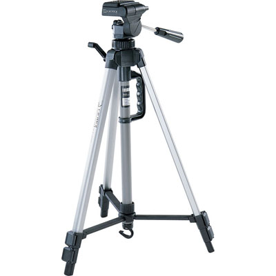
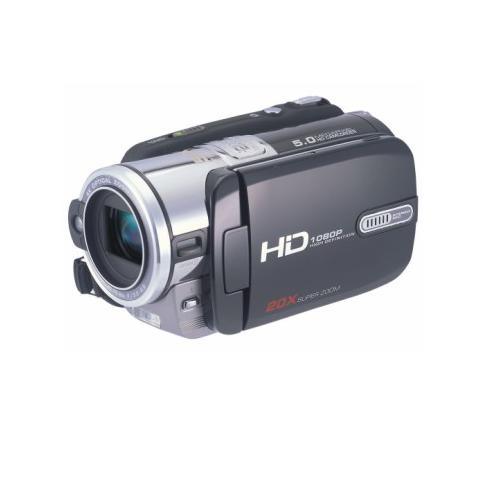
When we had to actually film the footage we used a HD camera, which were new to A2 from AS. This camera gave us a better quality of footage, compared to what we would of got from using the camera from last year, which was not a HD one.Using a camera that was high quality, this helped to make our music video look a lot more professional, as if it were a real one. Something that was a very useful and vital piece of equipment that helped us for both AS and A2 was a tripod.This was to make sure our shots were steady, so we didn't run the risk of having a shaky camera which could jeopardise our shots.
 Photoshop was a program that we used when making our Digipak and Mag Ad. It allowed us to edit our images, and change the colour easily, meaning we could change our front and back panel images to any colour or scale we wanted. Playing around with the effects helped us see what was best for both our Digipak and Mag Ad.


 The main new media technology I used during the whole coursework would be Blogger, this was our main place where we would blog about our research into our band, all the band information would be found here.
In order to record all our research and planning I created a blog. A blog is an online portfolio, which you can access both at home and at school, this allowed us to present all stages of our coursework, updating it on a daily or weekly basis. With blogger we also created a production blog for our production company Blazing Grace Productions we came up with the company name due to the constrast in 'blazing' and 'grace', feeling it was rememorable and made an impact.
 The production blog was mostly focused around the production of our music video, so it mainly included a filming schedule and updates on casting and shoots, we feel it should of been updated on a more frequent basis but all our rough cuts are up giving people a chance to watch our video in the process to its final cut. Blogger is also easily accessible, and can be found by certain Google searches, therefore widening the audience of who will view your blog, allowing you to gain more audience feedback. Blogger is also a good and quick way for our media teacher to access a look at our work so far without, as he created a blog aswell, meaning we can simply ask any questions if needs without being at school, as well as accessing gmail which I recieved emails about the progress from my media teacher and comments that were awaiting to be moderated. Also working with Asa Newmarch and Sophie Dixon, it meant I could keep up to date with work they were updating on there blog as part of our Research and Planning as we often split the research, helping us to see if we can add to a post or they can add to mine, this saved us a lot of time, we titled the post with each others initials meaning we could share the posts.
Another way Blogger is useful, is that you can in put hyper links which is always useful when trying to show in a post maybe where you gained your information, a hyper link is a direct link which you can place in your post, and it will take you or the person looking at that certain blog, straight to the source, or in some cases to a youtube page to show a video, if some videos will not embed. I used hyper links when speaking about Destinys Child, and linked the post to websites from their record co. and the history of Destinys Child.
Blogger also enable you to embed videos from sites such as YouTube and Vimeo so people can then view videos via your blog, meaning we can place rough cuts of our music video on our blog, and again with the fact people can view this and just write a comment makes it a very simple and quick way to gain audience feedback.
I have embedded many videos from Vimeo, such as a vodcast we uploaded, speaking about the updates within Blazing Grace, http://a2vid2012-katiem.blogspot.co.uk/2012/02/all-blazing-grace-update-so-far.html, before our course started I had already started using uploading videos from Vimeo and Youtube such as here, http://a2vid2012-katiem.blogspot.co.uk/2011/09/music-video-deconstruction-4-noah-and.html.
This is what it should look like when embedding a code to begin with:
 |
| Screenshot of process when embedding a code. |
 |
| Hyper links. |
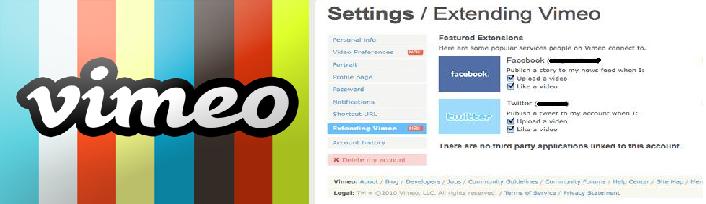 |
| You can share videos to Facebook & Twitter via Vimeo. |
Vimeo was also a useful source I used when uploading and sharing my videos. As you can see from the picture above Vimeo allows you to share videos on both Facebook and Twitter. This helped alot when wanting a quick and easy way to get audience feedback.

Youtube was also a very regular source myself and my group used. It's a lot faster and easier to use than Vimeo but as we can't access Youtube at school it was only a possible source when doing work from home. My Media teacher also had his own Youtube channel, this allowed us to watch other groups and our own videos in progress to the final cut. It was also easier to access comments on your videos for further audience feedback. Here is his youtube channel...
Youtube aloud us to watch videos, from home, when researching our genre we were able to watch previous music videos, from Destinys Child or other girl bands such as TLC , helping us look closely at the common conventions needed when making a girl band music video, rather than just seeing it in writing form, from websites such as Wikipedia. Also Youtube has pages for certain artists, with a list and links to their videos, only making it easier when trying to find videos for Destinys Child. Also Youtube allows you to see videos from people across the world so this shows a variety of cultural footprints, with whose talking about Destinys Child, or singing one of there songs. I've found that when looking at the cultural footprints, I saw a lot of teens both male and female between our target audience age range, 15-24. This gave myself and my group a better focus on what fans like about Destinys Child.

Scribd is also another site I used, this is a social publishing site, where you can share word documents and writings. Scribd was always useful, for when we wanted to upload writing documents, for example call sheets, story boards, and our treatment. We could not just straight away put them on do blogger with them being word documents, so we had to scan them using the scanner provided by media, and then upload them onto Scribd and then like we do with Youtube and Vimeo we then copy and pasted the embedded code into Blogger.
In order to upload our footage onto final cut we first of all had to import in onto iMovie, and then export the clips to Final Cut. These were the main two programmes used in the editing process for our music video.
Final Cut allows you to add more effects and transitions between clips, compared to iMovie and in Final Cut it also allows you to extract audio from clips, so when editing the audio can be taken away so anything you do not want in you can take out of the background noise of the shot. Final cut allowed us to put in layering effects and decrease and increases something called the opacity, which we used a lot in our music video, with our main theme being flashbacks.
Also when doing a Pod Cast, and say if the voice recorder is in use, then we will be able to use a video camera, which would then mean we had to extract the audio, in order for it to be a podcast.
 |
| HD Cam we used for Podcasts&Vodcasts and to film our final video. |
Also another website which was great to use when uploading Podcast's was Divshare. Its quick, simple and easy to use. Here is a Podcast using Divshare.When we had to actually film the footage we used a HD camera, which were new to A2 from AS. This camera gave us a better quality of footage, compared to what we would of got from using the camera from last year, which was not a HD one.Using a camera that was high quality, this helped to make our music video look a lot more professional, as if it were a real one. Something that was a very useful and vital piece of equipment that helped us for both AS and A2 was a tripod.This was to make sure our shots were steady, so we didn't run the risk of having a shaky camera which could jeopardise our shots.
Photoshop was a program that we used when making our Digipak and Mag Ad. It allowed us to edit our images, and change the colour easily, meaning we could change our front and back panel images to any colour or scale we wanted. Playing around with the effects helped us see what was best for both our Digipak and Mag Ad.
Here is our first draft for the Digipak. It looked way to cheap to be considered as a real one so we used different effects and came up with our final front panel:
We have not necessarily used effects but something else that Photoshop allows you to do it add text onto a picture which is what we decided to do.
Our Mag Ad on the other hand was used to experiment with Photoshop.
Here was our first draft. We felt that including a split screen effect at the side would help us to easily relate to the video as we include a split screen there, but instead we decided for a more simple but classy Mad Ag:
We kept the band members in colour whilst changing the background into a grey scale(black and white). we also used multi-layering in the top left hand corner, so this helped to include the music video in a more professional way.
Tuesday 8 May 2012
AN - Audience Feedback on Digipak
Today we managed to obtain feedback from our class colleagues on the second version of our digipak.
No information on the DVD.
Email address isn't needed.
No upper case in the web address.
The QR code needs to work, in order to show ICT skills. Linked to company blog.
The sticker on the front cover was way too big.
Huge line spacing can be seen on the sticker.
Copyright information needs to be smaller.
The main title on the front needs to be centred.
Use plain Sariff font if needed.

Inner panel 1
We decided to abandon the inner digipak design with the pictures of the wine bottles because my colleagues didn't understand the deeper meaning behind them.

Inner panel 2

Inner panel 3
.jpg)
Hidden credits panel
Panel behind the front cover
These next images are the panels which have been improved:
Front cover

Back panel
Now the QR code leads to the Blazing Grace production blog.
SpineOverall from this feedback while the outer panels are fine, the inside panels need changing. So now I will allow Sophie to make the inside of the digipak and I will take over making the magazine in order to speed things up in terms of scheduling.
No information on the DVD.
Email address isn't needed.
No upper case in the web address.
The QR code needs to work, in order to show ICT skills. Linked to company blog.
The sticker on the front cover was way too big.
Huge line spacing can be seen on the sticker.
Copyright information needs to be smaller.
The main title on the front needs to be centred.
Use plain Sariff font if needed.

Inner panel 1
We decided to abandon the inner digipak design with the pictures of the wine bottles because my colleagues didn't understand the deeper meaning behind them.

Inner panel 2

Inner panel 3
.jpg)
Hidden credits panel

Panel behind the front cover
These next images are the panels which have been improved:

Front cover

Back panel
Now the QR code leads to the Blazing Grace production blog.

SpineOverall from this feedback while the outer panels are fine, the inside panels need changing. So now I will allow Sophie to make the inside of the digipak and I will take over making the magazine in order to speed things up in terms of scheduling.
ALL - Mag AD, Draft
After many delays and issues, we finally managed to finish the magazine advert thanks to Miss Sophie Dixon, with some Photoshop advice from me of course. Anyway deconstructing the advert, it is made up of four pictures of the band. The band's clothing denotes the male gaze theory where the audience is shown that women are treated nothing more than seductive objects for male desire.

Here is an example shown to promote the 360/PS3 title,
Ninja Gaiden 3 which comes out next week. Yey!
Pink text is used at the top left hand corner of the advert, to attract a female audience towards the digipak since it is the prime colour associated with women. Twitter and Facebook links to the company/band pages can be seen at the bottom left hand corner of the page. This is a common convention seen across different media products from music videos to even video games.
As for what the advert is advertising, it is promoting the upcoming release of the digipak as shown by the release date in silver. Little text is shown to give the advert a mysterious feel with the only piece of information being a date of 15th March.

ALL, Digipak, Draft
Here is the final version of my digipak. As shown below, there are 3 main panels which can be folded out.
On the front cover we have a ripped picture of the band which links in with the break up theme of the video
Then on the inside we have three panels of the band member's faces shown on a bottle of wine with two glasses. On the first panel they're empty, second they're full and third, one glass has a tiny bit of wine next and the other glass is smashed.
When you fold out the first panel, a "saucy" picture of the band is seen. This links in with the male gaze theory because of the artists' clothing. Leading to male target audience.
If you fold the middle inside panel, the credits of the digipak can be seen. Which includes, the roles of the group and links to the company's Twitter and Facebook pages
The discs come out of two disc sleeves which are part of the two panels on the sides of the middle one.
Lastly on the back of the digipak we have the track and extras listing. Besides that, we also have a link to the main website, bar and QR codes along with a picture of band members walking away.

Tuesday 1 May 2012
Podcast 5 - Asa speaking about Audience feedback and more
In this podcast, I go solo by talking about the feedback from some friends of mine. I go into detail on topics such as long chunks of narrative and the use of Sepia.
AN - Rough cut 2 feedback
Today in class, we managed to obtain some feedback on our second rough cut. Although a new cut is in the works, this feedback was still useful. Here is what our colleagues said:
Performers need to vocalise.
Sepia is good.
Generate a still image at the beginning.
Cross faded
More performance sequences needed.
More dance moves need to be seen.
Shaky shots in some places
Cut down on the amount of narrative.
More slow-motion needs to be used in certain places.
Get a fixed shot of the rose.
Edit the video so it fits in with the beat and pacing of the track.
More variation in footage.
Split screen technique needs to be used.
Clumsy use of media language. e.g. shot of member's leg.
Layer clips
Cut to beat at points
Aspect ratio needs changing.
Change the band member's positioning around at points in the video.
AN - First rough cut of Mag Ad
After many delays and issues, we finally managed to finish the magazine advert thanks to Miss Sophie Dixon, with some Photoshop advice from me of course. Anyway deconstructing the advert, it is made up of four pictures of the band. The band's clothing denotes the male gaze theory where the audience is shown that women are treated nothing more than seductive objects for male desire.
Here is an example shown to promote the 360/PS3 title,
Ninja Gaiden 3 which comes out next week. Yey!
Pink text is used at the top left hand corner of the advert, to attract a female audience towards the digipak since it is the prime colour associated with women. Twitter and Facebook links to the company/band pages can be seen at the bottom left hand corner of the page. This is a common convention seen across different media products from music videos to even video games.
As for what the advert is advertising, it is promoting the upcoming release of the digipak as shown by the release date in silver. Little text is shown to give the advert a mysterious feel with the only piece of information being a date of 15th March.
AN - First rough cut of Digipak
Here is the final version of my digipak. As shown below, there are 3 main panels which can be folded out.
On the front cover we have a ripped picture of the band which links in with the break up theme of the video
Then on the inside we have three panels of the band member's faces shown on a bottle of wine with two glasses. On the first panel they're empty, second they're full and third, one glass has a tiny bit of wine next and the other glass is smashed.
When you fold out the first panel, a "saucy" picture of the band is seen. This links in with the male gaze theory because of the artists' clothing. Leading to male target audience.
If you fold the middle inside panel, the credits of the digipak can be seen. Which includes, the roles of the group and links to the company's Twitter and Facebook pages
The discs come out of two disc sleeves which are part of the two panels on the sides of the middle one.
Lastly on the back of the digipak we have the track and extras listing. Besides that, we also have a link to the main website, bar and QR codes along with a picture of band members walking away.
Subscribe to:
Posts (Atom)